Dashboard
Overview of the Advertiser Dashboard
When you are logged in as an Advertiser, the Dashboard will show you key information to give you insight into how your campaigns are performing.
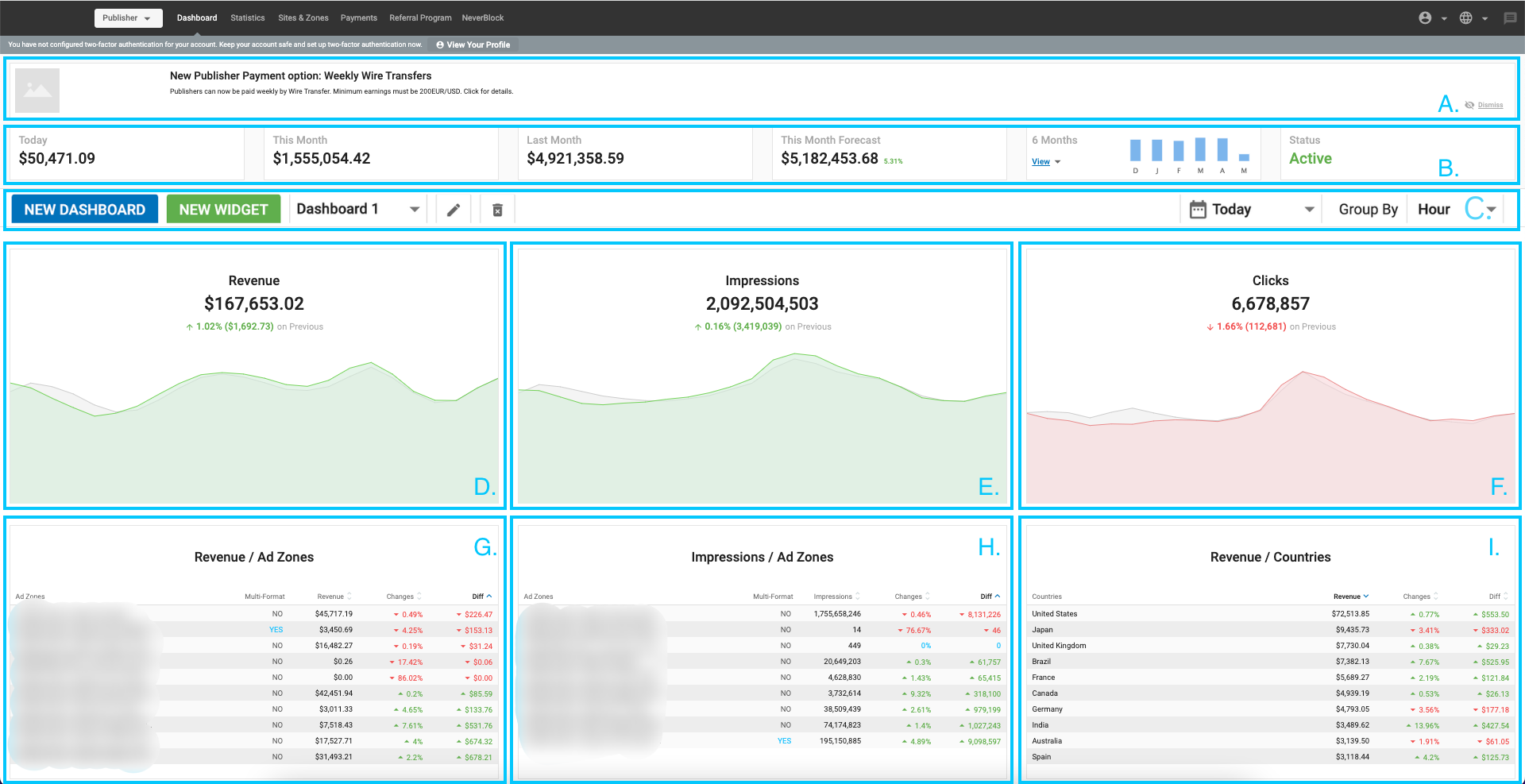
Top Panels (A) and (B)

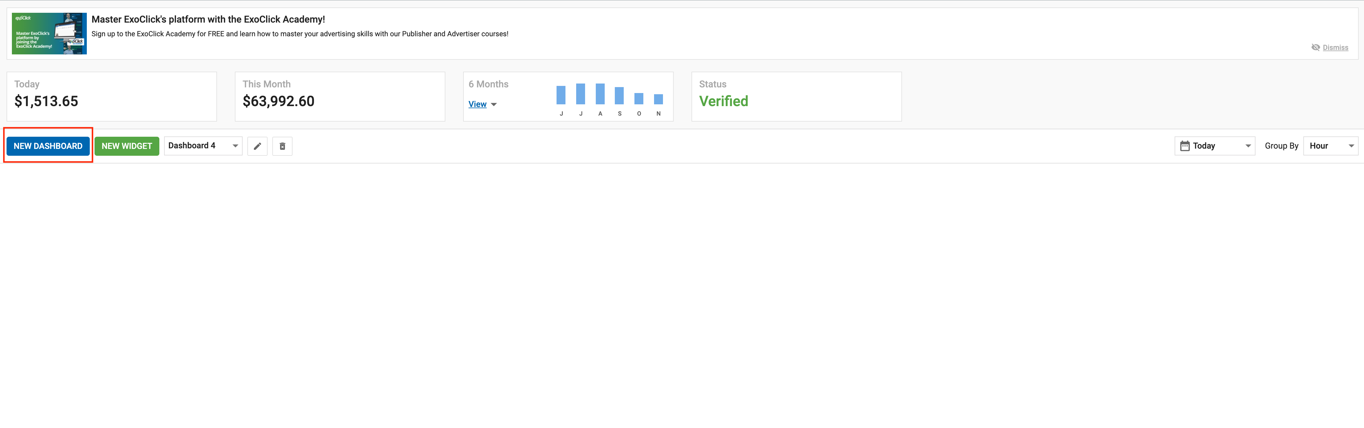
At the top of the Advertiser Dashboard you can see the News Panel (A), which shows any current news that may be of interest to you. You can dismiss or hide the news by clicking on the Dismiss icon on the right of panel (A).
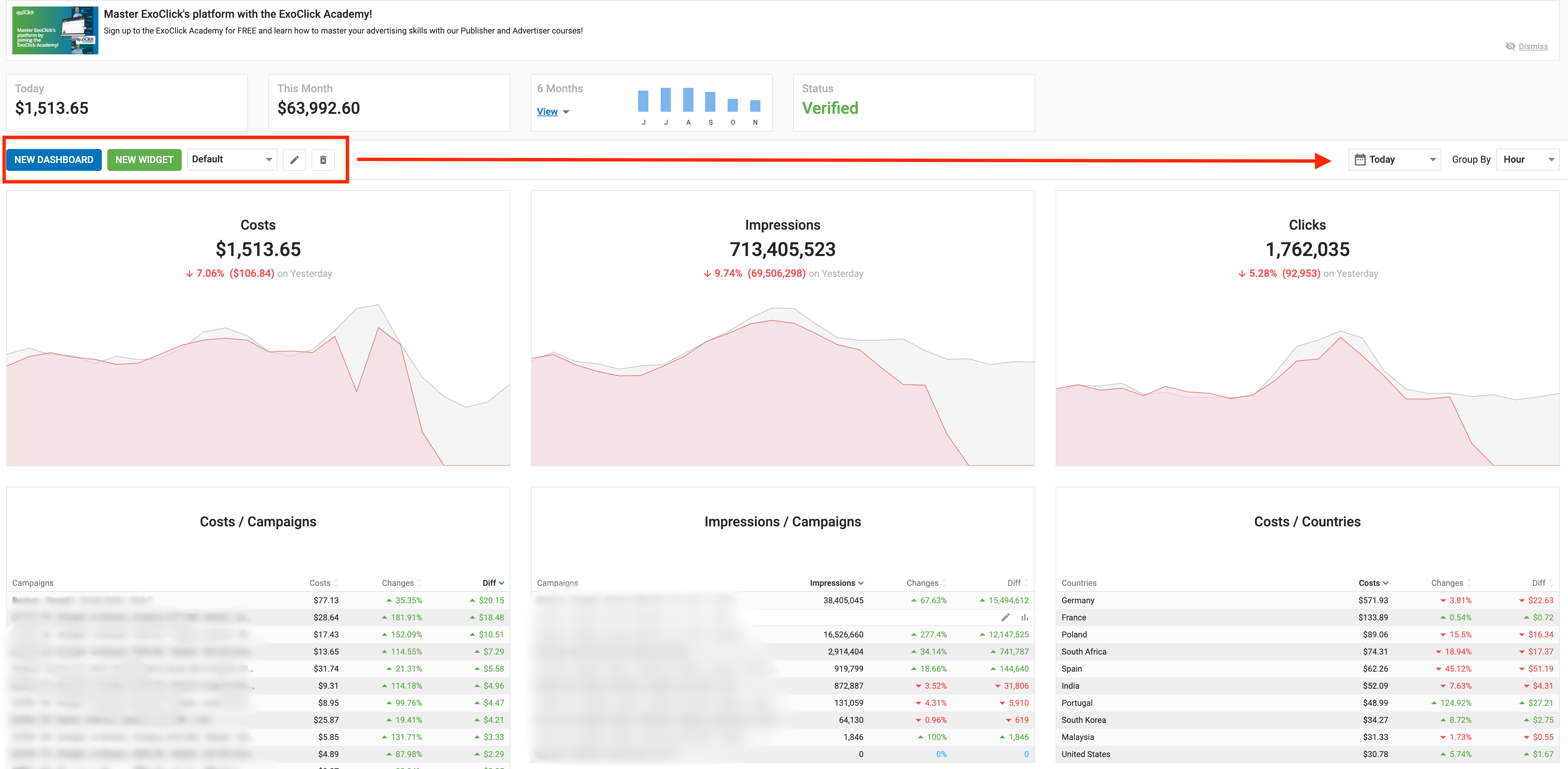
Below this in (B), you can see your current Balance in green, and the amount you have spent on campaigns for Today, This Month, and the last 6 Months. Click View to see the graph for the past 6 months. The Status panel shows you the Status of your account, whether it is Verified or Unverified to run advertising campaigns.
Note: In the following sections you will see descriptions of the default charts and tables that show on the Dashboard. However, you can customise the dashboard to show any charts and tables that meet your needs.
Graphs (C), (D), (E), AND (F)
 In (C) you can choose to add new dashboards and customize each dashboard to your needs. Also, you can choose a time option Today, Yesterday, Last 7 Days, Last 30 Days, This Month, or Last Month. You can read more about this section here in this document.
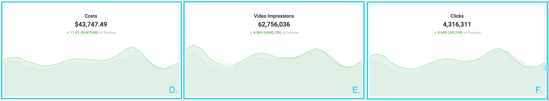
Each of the three graphs in (D), (E), and (F) shows two lines, to enable you to compare how things have changed in the time period you selected. The red/green line shows the later time, and the grey line shows the earlier time for comparison.
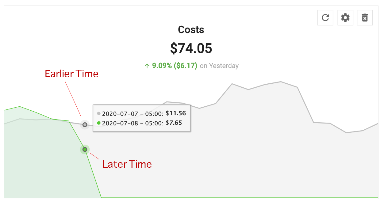
So, if you have chosen This Month in as a time period, any point on the red line will show you a date from this month, and the grey will show you the corresponding date from the previous month.
Note: When you select Today in as a time period, the two line graphs will compare times in the current day to the same time in the previous day.
When you select Yesterday in as a time period, the two line graphs will compare individual times in hours from yesterday to the same times in the day before that.
D. Costs: This graph shows the total you have spent on your campaigns in the selected time period. The red/green line graph shows the total for the selected time period, while the grey line graph shows the period before that.
E. Video Impressions: This graph shows the total video impressions your ads have received. The red/green line graph shows the total for the selected time period, while the grey line graph shows the period before that.
F. Clicks: This graph shows the total clicks your ads have received. The red/green line graph shows the total for the selected time period, while the grey line graph shows the period before that.
Tables (G), (H), and (I)
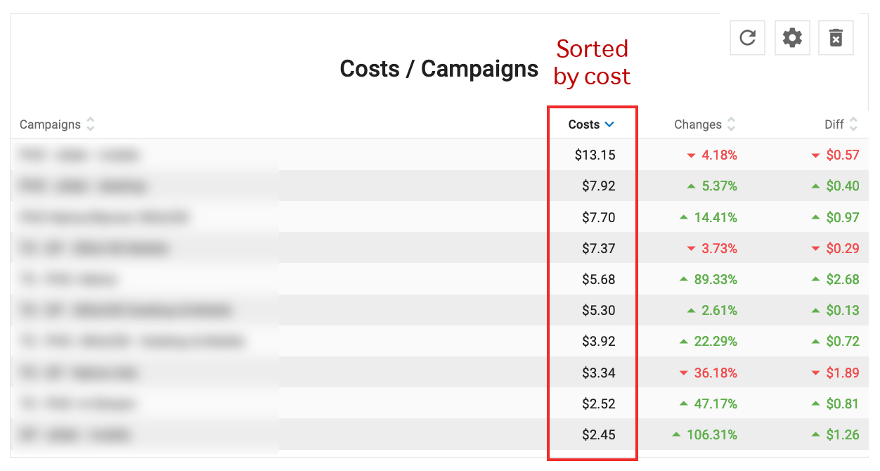
G. Costs / Campaigns: This table shows your spend on ten selected campaigns. The choice of campaigns is determined by the Campaign, Cost, Change, and Diff columns: When you click on one of these headers, the list is sorted by highest/lowest value, and the campaigns that display will change accordingly.
- Cost shows the amount of money spent on the campaign in the selected time period.
- Changes shows the percentage change in cost for the campaign in the selected time period.
- Diff shows the difference in cost for the campaign in the selected time period.
H. Costs / Zone Types: This table shows your costs for ten selected zone types. The choice of zone types is determined by the zone, cost, Change, and Diff columns: When you click on one of these headers, the list is sorted by highest/lowest value, and the zone type that display will change accordingly.
- Cost shows the costs for the zone type in the selected time period.
- Changes shows the percentage change in impressions for the campaign in the selected time period.
- Diff shows the difference in impressions for the campaign in the selected time period.
I. Cost / Countries: This table shows your spend on ten selected campaigns. The choice of campaigns is determined by the Country, Cost, Change, and Diff columns: When you click on one of these headers, the list is sorted by highest/lowest value, and the campaigns that display will change accordingly.
- Cost shows the amount of money spent on the campaign in the selected time period.
- Changes shows the percentage change in cost for the campaign in the selected time period.
- Diff shows the difference in cost for the campaign in the selected time period.
Action icons in the tables
![]()
If you roll over any campaign name in the table, two icons will appear on the right side of the table: Edit and Statistics.
- Clicking on the Edit icon will take you to into Step 1: General Details of that campaign, so that you can edit it.
- Clicking on the Statistics icon will take you into the Statistics tab, filtered for that campaign.
Customizing your Dashboard
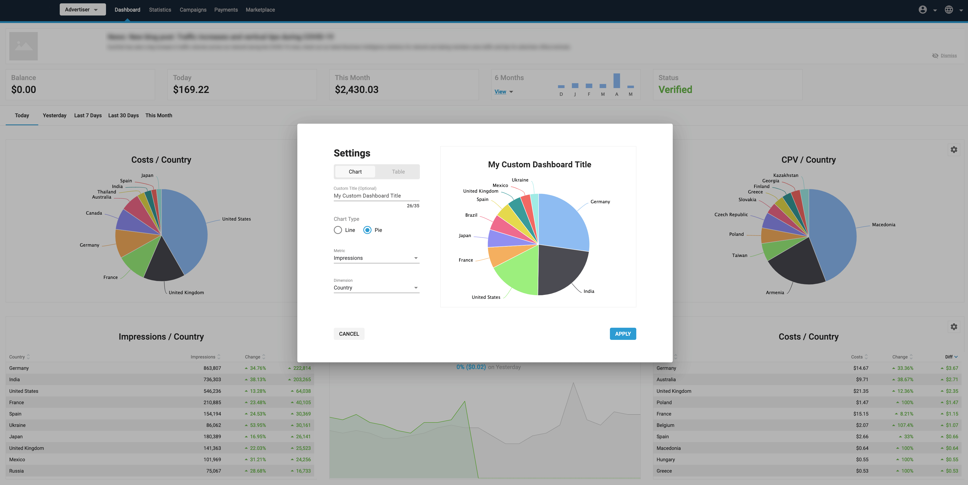
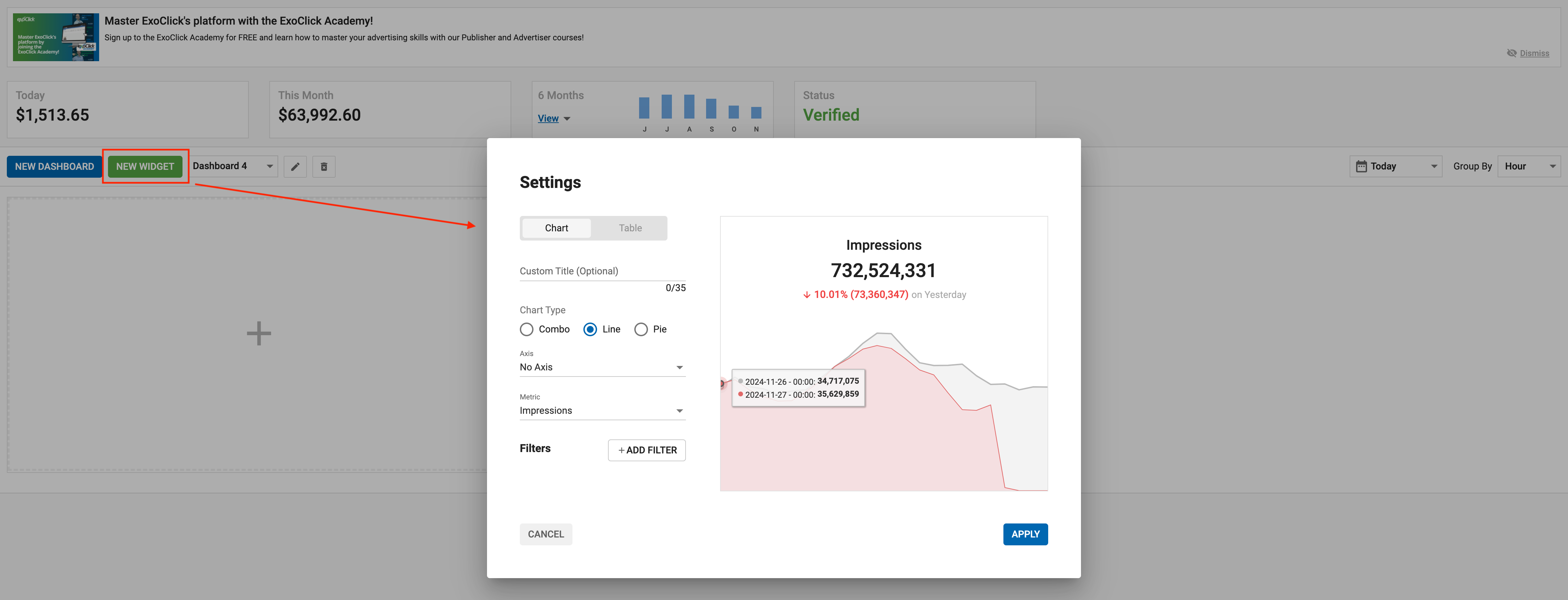
It's also possible to customize the data shown in your Dashboard. You can choose from a selection of metrics and dimensions to show in the 9 slots of your Dashboard. This can help you to focus your dashboard on the particular data that is most relevant to your business.
In the top right of each of the 9 slots, click on the settings icon to customize the data shown in any of the panels. The Dashboard Settings pop up will appear. Here you can set what metrics you wish to see in the tab:
Set whether you wish to see a Chart or a Table using the tabs.
Adding a Custom Title
Advertiser can save a Custom Title for each large widget in the dashboard. This Custom Title field is optional. You can add a Custom Title that best suits that Widgets settings.
Creating a chart
If you choose Chart you can then select whether to show a Combo chart, Line chart, or Pie Chart:
- Combo: Select a Metric to show on a bar chart, with a Secondary Metric to show on a line chart.
- Line: Select a Metric to show on the line graph. This will show two lines, one for the selected time period e.g. days, and a red/green line for the corresponding time period before that.
- Pie: Select a Metric to compare with a Dimension from the drop-downs.
After selecting the chart type, metric, and dimension, click Update Preview to see the result on the right side of the Dashboard Settings box.
Click Apply to show this chart on your Dashboard.
Creating a table
If you choose Table, select a Metric to compare with a Dimension in the table.
You will see a preview of your table on the right side of the Dashboard Settings box.
Click Apply to show this table on your Dashboard.
Adding and deleting widgets on your dashboard
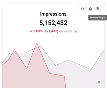
You can delete any of the six charts/tables on you dashboard by clicking the delete icon on the top right of any of them.
Once a widget has been deleted, you can add a completely new one by clicking on the New Widget button. You can then set up the chart/table to meet your needs.

Filtering your tables or charts
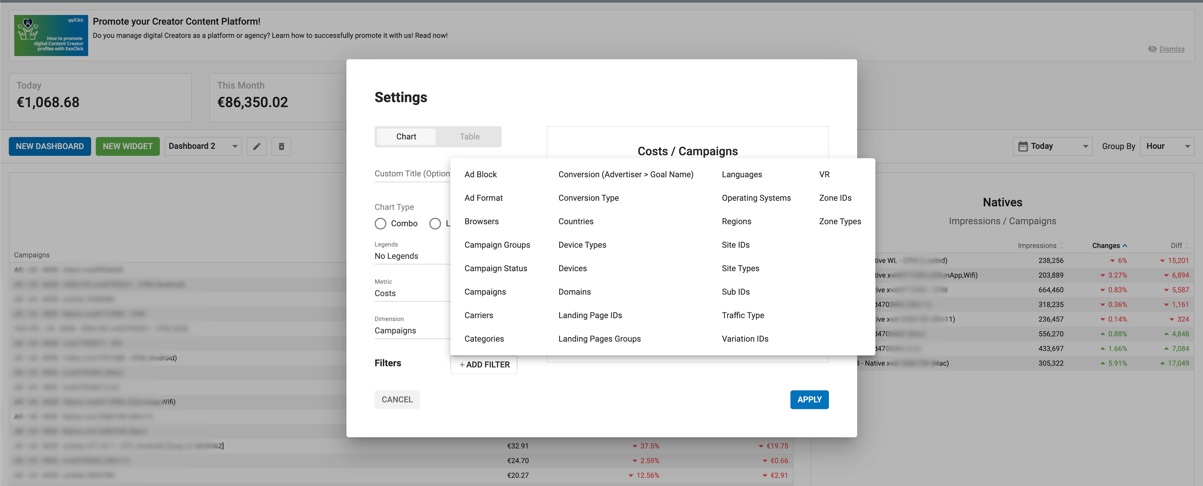
You can also add a filter to any charts or tables you create on your dashboard. For example, you could create a Line graph showing today's spend, and then filter it by Browsers.
To do this, click the +Add Filter button at the bottom of the Dashboard Settings panel, and select a filter from the list:
- When you choose a filter, you can then choose which items you wish to filter by: For example, if you choose to filter by Browsers, you can then use the checkboxes to choose which browsers to filter by.
- Use the Show selected only checkbox to exclude the items that you haven't selected, and choose Select All to select all items.
- You can add multiple filters by clicking on the Add Filter button again.
Once you have added the filters you require, click on the Update Preview button on the chart or table to see how it looks.
Once a widget has had a filter applied, you will see a Filter applied symbol on the left side of it:

Available Filters for Advertisers
- Ad Block
- Ad Format
- Browsers
- Campaign Groups
- Campaign Status
- Campaigns
- Carriers
- Categories
- Conversion Type
- Conversion (Advertiser > Goal Name)
- Countries
- Device Types
- Devices
- Domains
- Landing Page IDs
- Landing Pages Groups
- Languages
- Operating Systems
- Regions
- Site IDs
- Sub IDs
- Variation IDs
- VR
- Zone IDs
- Zone Types
Adding New Dashboards
As an Advertiser, you can create multiple custom Dashboards. This way, you can setup each of your Dashboard with specific data that is most relevant to your business. This will allow you to organize multiple Dashboards and see at a glance the information that you need to know.
Add New Dashboard
- Click on the New Dashboard button to add a new Dashboard.
- Click the New Widget button to add a widget, then update it with a table or chart and the metric that suits your needs.
Rename a Dashboard
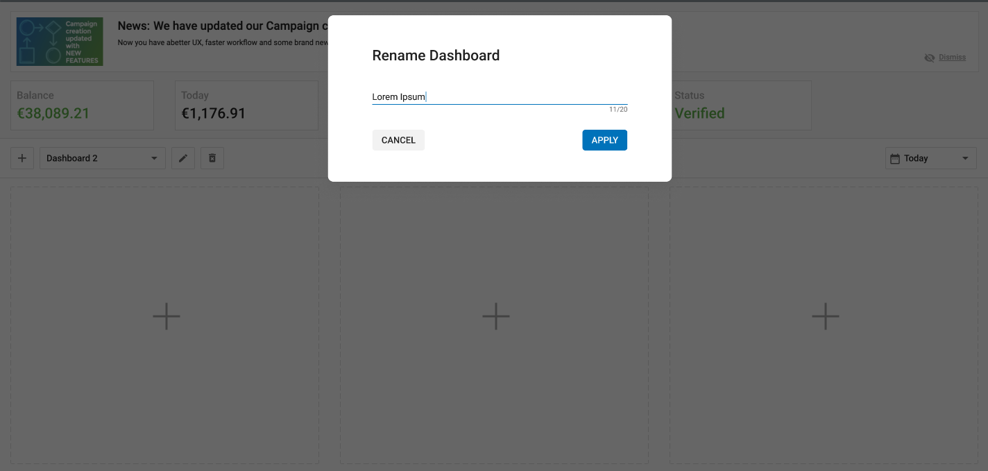
- Click on the Pencil icon to rename a Dashboard.
- You can choose a name that best defines the information you choose to display on that Dashboard.
- Click on APPLY button for this name to be saved.
Delete a Dashboard
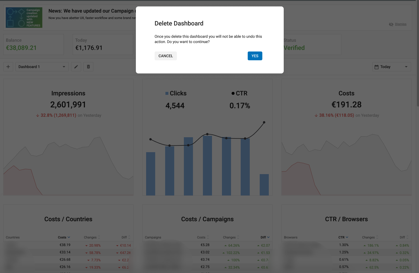
- Click on the Bin icon to delete a Dashboard.
- Once you delete a Dashboard, you will not be able to undo this action.
- An Advertiser can delete all dashboards if need be.
Drag, Drop and Expand Dashboard Widgets
As an Advertiser, you will be able to drag, drop or expand any widget within the Dashboard. This will enable you to easily change the position of widgets and/or expand them, such that your dashboards are highlighting the relevant data in the best way possible.
Expand Dashboard Widgets
- The four corners are highlighted with expand icons.
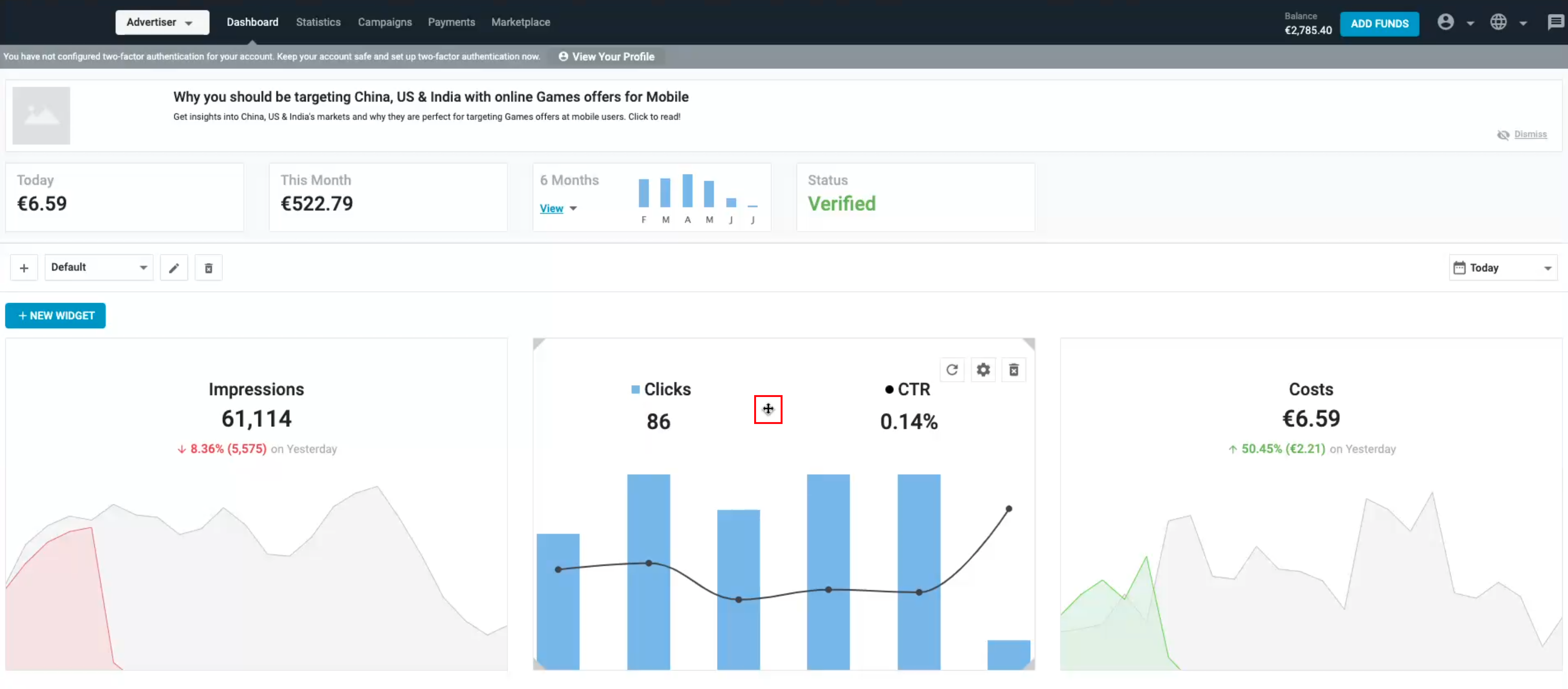
- The cursor changes to a four headed cursor anywhere on the widget where it can be expanded along any of it's four sides.
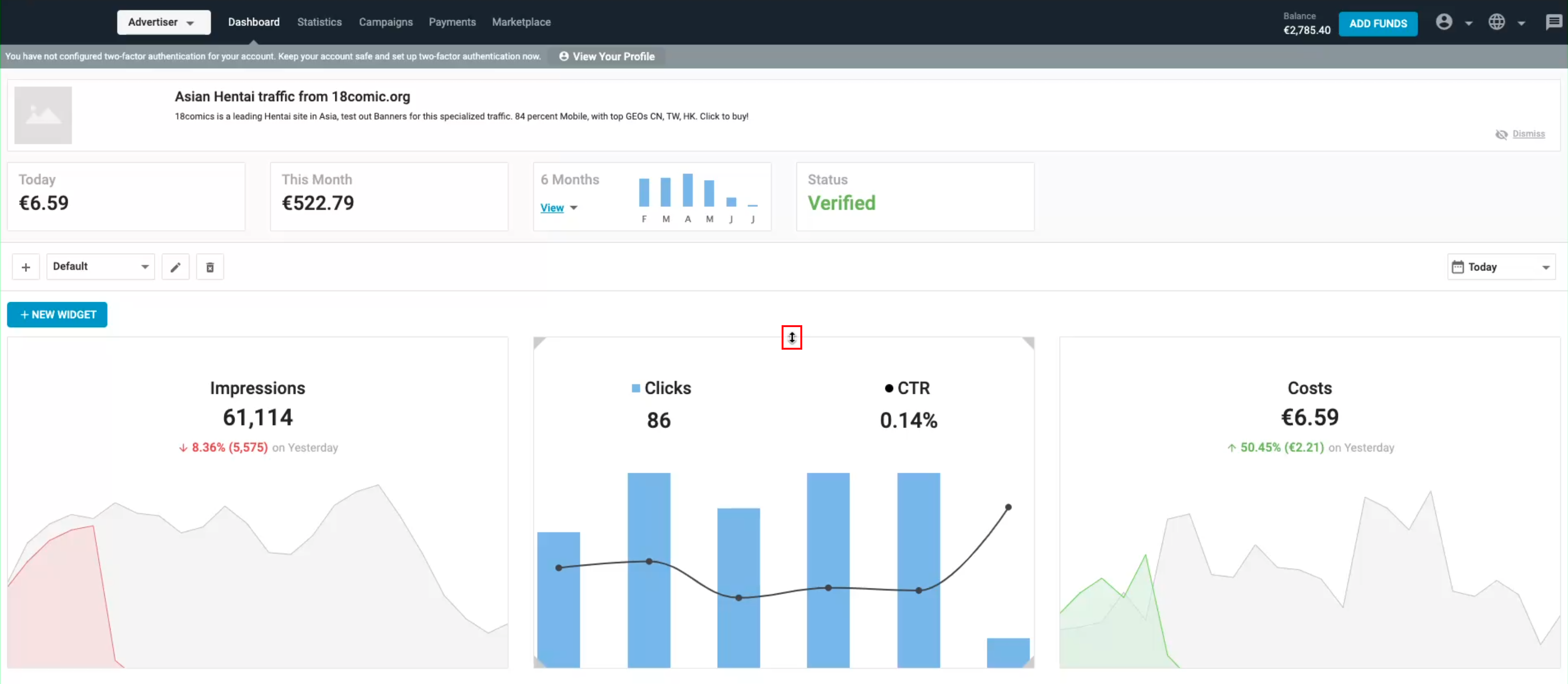
- The cursor changes to a two headed cursor when hovering over the top/bottom or right/left borders of the widget respectively.
- Using your cursor you will be able to use the new features as you require.
Drag and Drop Dashboard Widgets
- Using the cursor, you can change the position of any widget by dragging and dropping them from one place to another.
- A grid is shown in dotted lines in the background while moving a widget which acts as a template for you to know which spot is available.
Note:
- The maximum number of widgets in any dashboard is 18.
- The maximum size of an expanded widget is 2x2.
- While resizing or drag and drop of a widget the neighboring widgets will automatically adjust/move to the next available space.